Beauty Tips for Academics
Tip 1
Choosing a suitable typeface
Homogeneity is key.
The choice of the typeface depends on the type of text you are writing:
- If your text contains characters from different alphabets (e.g., Greek letters in mathematical formulas in a text otherwise composed of Latin characters), then you ideally choose a font that includes all the characters you need. This ensures aesthetical consistency of the main text with the foreign characters.
- If your text contains a substantial amount of mathematical expressions (variables, formulas), it will probably include a large number of italic characters. In this case, choose a typeface that features only modestly sloped italics (say, Minion).View the font on the Adobe website: Minion 3.This is because typefaces with strongly sloped italics (say, Adobe Garamond) tend to make the page look uneven.View the font on the Adobe website: Adobe Garamond.
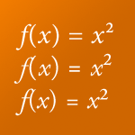
- Minion (top): well-suited. Due to the moderate slope of the italics, the ascender of the f does not collide with the opening parenthesis, and the italic x does not collide with the superscript.
- Adobe Caslon Pro (middle) and Adobe Garamond Pro (bottom): less suited. The strongly sloped italics of Caslon and Garamond make the ascender of the italic f collide with the opening parenthesis. Also the italic x is too close to the superscript.
Here are some recommendations concerning typefaces that are suited for mathematics-heavy texts:
- Nature homepage:Minion (from Adobe, was used, e.g., by Nature and is still used by the Journal of Neuroscience): includes Greek letters and some mathematical symbols, its italics are moderately sloped.
www.nature.com - Palatino Linotype: bundled with Microsoft Windows, includes Greek letters and some mathematical symbols.
- Times New Roman: bundled with Microsoft Windows and macOS, includes Greek letters and some mathematical symbols.
- Meta Pro (from FontShop), suited for headlines, includes Greek letters and some mathematical symbols, its italics are moderately sloped.
Be careful when using sans-serif typefaces (like Arial) for mathematical texts. Some characters (e.g., uppercase I and lowercase l) look virtually identical in many sans-serif typefaces. This would make the respective variables indistinguishable in mathematical formulas.
Sans-serif typefaces that are suited for mathematical typesetting are Fira Sans/FiraGO and the accompanying Fira Math, IBM Plex Sans, and Meta Pro: with these fonts, characters like I, l, and 1 (numeral one) are clearly distinguishable.

Tip 2
Choosing a suitable font size
Smaller may be better.
A common misperception concerning font sizes is that a larger size will make a text more legible. Actually, larger font sizes can reduce legibility. This is because we do not read texts letter by letter but rather process entire words, or even groups of words, at once. A larger font size makes fewer letters fit into the focus area of the human eye, thereby slowing down reading.
At the same time, academic texts often feature superscripts and subscripts—and maybe even nested superscripts. In this case, the font size becomes smaller with each level. Hence, the baseline font size should not be too small.
As a rule of thumb, I would advise to use a font size of 11 pt for body text.
Tip 3
Choosing a suitable line width
Shorter is usually better.
When looking at newspapers, magazines, and books, you will realize that either the page size is much smaller than standard paper formats for computer printers (many books are smaller than A4 or Letter paper), or the text area is broken up into several columns. This is because shorter lines tend to increase legibility: At the end of each line, our eye has to travel back left to the beginning of the next line. Finding the beginning of the next line is easier with shorter lines.
Moreover, relatively short lines even on relatively large paper give the reader (auch as reviewers or thesis advisors) sufficiently large margins that they can use for annotations.
Tip 4
Choosing a suitable line spacing
More is—usually—better.
Moany academic texts feature footnotes, leading to a large number of superscripts in the text. Mathematical in-line formulas also frequently include superscripts and subscripts, calling for enlarged line spacing compared to nonacademic texts.
As a general rule, one should rather use a line spacing that is too large than too narrow.
However, there exists a custom to require students to format their theses and authors to submit their manuscripts “double-spaced” or something similar. This is clear overkill and leads to an ugly page layout. The demand for “double spacing” is usually accompanied by a demand for too large font sizes and too wide lines. You should avoid this whenever possible.
Those advocating double spacing frequently argue that it prodives supervisors or reviewers with the space needed to insert comments and annotations. This is achievable, however, in an aesthetically much more pleasing and for the reader more comfortable way: reduce the line width—and simultaenously the line spacing—to create large (outer) margins that readers can use for their annotations.
Tip 5
Use style sheets
Styles help you achieve consistent formatting of elements of identical type, and they simplify your life.
One feature of the open-source typesetting system LaTeX is that it induces authors to reason about the structure of their texts. This is because in LaTeX, you enter formatting commands manually, such as:
\section{A First-Level Headline}
\subsection{A second-level headline}
This is the body text of the \emph{first} subsection.
\subsection{The next second-level headline}
This is the body text of the \emph{second} subsection.
LaTeX then takes care of formatting all segments of the same type (say, \section) in a consistent way: same font, same font size, same font weight, etc. Importantly, it also takes care of consistent spacing, that is, in front of each \section there is a certain amount of white space, in front of each \subsection there is a little less white space, etc.
Using styles and creating custom ones is also possible in Word & Co., of course. You should definitely make use of this possibility! Here is why:
- It induces you to deliberate about the structure of your text.
- It results in consistent formatting of all elements to which a particular style has been applied. This turns out to be especially helpful when adjusting the formatting: all you need to do is to change the style once, and the formatting of all elements set in the respective style is updated automatically.
- Most word processing softwares have a feature to create a table of contents. The success of this feature depends on the consistent application of style sheets, because the feature accesses the information contained in these style sheets to determine what belongs in the table of contents and what doesn’t. For instance, when creating a table of contents in Word that lists the first two hierarchical levels, everything labeled as Heading 1 and Heading 2 will be included.
What’s the Problem?
Complex Hierarchies
Beauty Tips
Seriously Elegant
LaTeX/XeLaTeX Templates
Long-Form Texts
Articles, dissertations, bachelor’s/
Presentations
Talks, lecture slide
Posters
Conference posters, exhibition posters